
Artway is a provider of art materials, technical drawing equipment and other creative supplies for students, institutions and the wider artistic public. Based in Melksham, Wiltshire, they have over 20 years of experience in supplying high quality arts and crafts supplies at competitive prices with a focus on sustainability and the environment.
Client: Artway
Industry: Art Supplies
Service: Theme Onboarding
Challenge
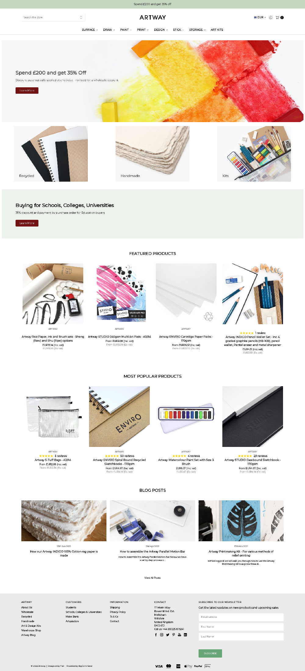
Artway wanted to refresh their website so they went to the BigCommerce Theme Store to find a new look. The theme that stood out to them was Kings Road Decor, designed and developed by Flair.
A theme onboarding is a relatively straightforward process. Clients provide us with their colors, logo and fonts. We then configure the theme, optimize the navigation and adjust product pages for conversions to give them a unique advantage over their competitors.
However, the challenge here is that Artway also wanted some tweaks to the design to make the theme work better for them. After they put together a brief and discussed their requirements with us, we got to work.
Solution
Artway first requested some tweaks to the product cards. They wanted the product titles’ capitalization to reflect how the products are entered into BigCommerce, and not upper case. Kings Road Decor offers price ranges that show the range of prices a product can be purchased for on the product grid. However, they wanted to show the prices with a “from” label instead, as they had on their existing store.
Kings Road Decor does offer a sticky navigation option which they wanted to use, but they wanted to make the marketing banner that appears at the very top of the page to be part of this.
There were also some alterations they wanted to make to the blog area. They wanted to change the title of the blog section on the homepage, and on the blog post page they wanted the content area to be wider.
On their category pages they wanted the products to appear first with the description text appearing lower down the page, left aligned.
The majority of their customizations were on the product page. On the base theme you can choose to have the product description either to the right or below the product image. Artway wanted the description to remain below the image but also have an accordion style menu to the right of the product image. Below the main product description they wanted to incorporate the Stamped.io review app that they currently use.
Using custom fields, we created a “Core Features” section at the top of the accordion, which is expanded on page load. This keeps a short product description above the fold.
Some products provided many options and Artway felt mobile customers would have an issue with the price being pushed further down the page they wouldn’t see the price being updated. The solution to this was to create a sticky add to cart panel that affixes to the bottom of a mobile screen when the user scrolls.
Results
Artway now has a clean looking and easy to navigate store. The branding they provided us has been used carefully throughout the site to create a great balance between the different sections.
Having the marketing banner as part of the sticky navigation is an interesting feature and something we will investigate further in future theme development. We should consider that the sticky navigation element needs to avoid being too tall so it doesn’t take up much of the vertical screen space, especially on smaller screens.
The new store launched at the start of May, so as of the time of writing this case study, it has been live for three months. Here is the comparison of May to July 2022 and May to July 2021 store analytics.

We have continued to improve the conversion rate for Artway, but the key improvement is that the Average Order Value has increased by over 30%, therefore boosting revenue.
If you would like to work with Flair to improve your conversions and boost your AOV, please get in touch with us today.